Beyond menus and toolbars: The Ribbon
When we set out to redesign Microsoft Office, we had no idea that many of the concepts we invented would go on to deeply influence an entire swath of productivity software over the coming decades.
In retrospect, it shouldn’t have been a surprise. The same problems we had set out to solve—complicated software with many commands, befuddled users, and too many ways to do the same thing—are not endemic just to Microsoft. So, of course others took these ideas and built upon them to make their own apps better!
One piece of the experience stood out as the most duplicated piece of our UI: the Ribbon. It was the centerpiece of our design, and it probably ushered in the last great wave of desktop-only productivity experiences.

I certainly couldn’t have expected the breadth of kinds of software we would ultimately see use the Ribbon: software for architects, musicians, writers, engineers, doctors, lawyers, students, artists, and just about anyone else one could imagine. Though we didn’t design the Ribbon for every app, I’m definitely gratified that it helped play a part in modernizing so many experiences.
A closer look
Just for fun, here was the first picture we drew of the Ribbon, way back in 2003. You can see though many things changed between this early sketch and the final version, the bones were there from the beginning.
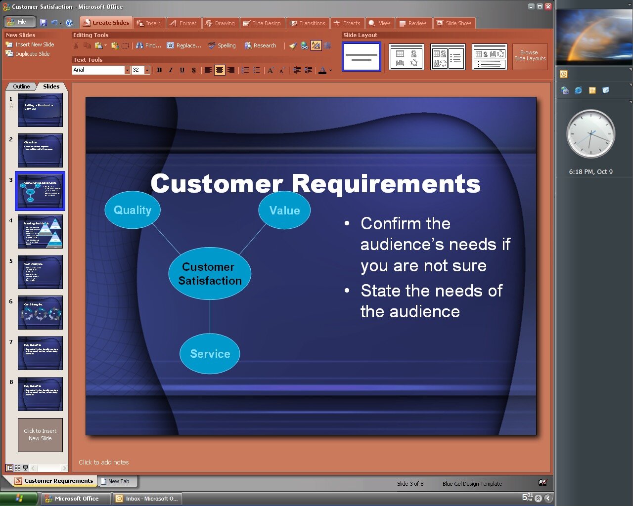
The weird red color came from an idea that we had (that Microsoft eventually did over a decade later!) that every app would have its own color. The PowerPoint color was this tomato-like hue, thus this set of pictures became known to us as “Tomatoeey.”
The rest, as they say, is history!

One of the controversial design decisions we made was to make the Ribbon horizontal. While this might seem to be an obvious decision (since menus and toolbars were historically at the top), it actually made our lives a lot harder in one crucial way: scaling to various window sizes.
It’s easy to imagine (and we had many pictures of it) a list of commands along the left side and a scroll bar or other widget letting you page up and down the long list of commands.
It was exactly for this reason I insisted we do it horizontally. Because horizontal scrolling is hard, it meant we had to be very thoughtful about the design. It forced us to look at every screen and really think about how we wanted to use the space.
As a result, every group in the Ribbon (in this picture labeled as “chunks”, our internal name) had as many as four different designs: large, medium, small, and collapsed. The Ribbon uses a system of group prioritization to decide what to show depending on the window size; the end result is an efficient and predictable use of space.
So many other apps ended up using the Ribbon; this was not something we ever anticipated when designing the UI system.
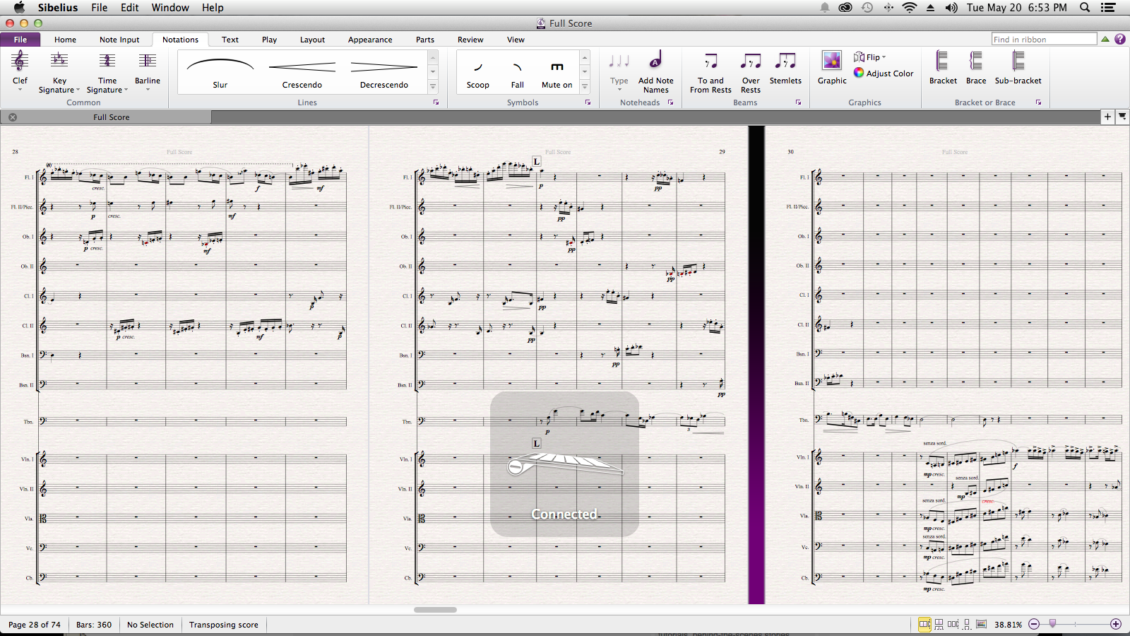
As a classical trained musician, I was amazed and surprised when Sibelius (the music notation software I personally use) released a new version with a complete implementation of the Ribbon.
They did a great job with it, using galleries to show in a visual way concepts, markings, and styles that were hard to represent in their old interface.

AutoCAD, the industry-leading computer-assisted design software used by engineers, architects, and construction planners, adopted the Ribbon early on and used it to unify their commands into one single place.
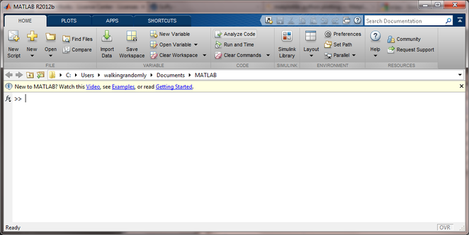
MATLAB, the ubiquitous software used by scientists, engineers, and mathematicians adopted the Ribbon user interface in 2012. Some of the things they did, such as including Search as part of the core interface, was later added in Microsoft’s own version of the control.

The Ribbon eventually made its way elsewhere within Microsoft. Notably, it showed up in several of the Windows built-in apps, adorning Paint, WordPad, and File Explorer.
More information
A lot has been written about the Ribbon, both by me and by others in the industry. Some people love it, some people dislike it, and of course, there’s everything in between.
An important thing to remember is that no user interface affordance can be good at everything. The Ribbon was optimized around solving a very specific set of problems (both usability issues and competitive pressures) for Microsoft Office specifically circa 2003-2010.
If you are want to learn more about what went into creating this UI, seeing more of the early sketches (including some wildly different discarded designs), and hearing behind-the-scenes stories of how it came together, you might enjoy watching my talk from MIX08: