Creating the modern email experience
My first job after college landed me on the nascent Outlook team at Microsoft. I had an opportunity over the six years I was there to help figure out how so many core scenarios should work: email, calendar and scheduling, spam filtering in its infancy, contact and task management, cross-platform, programability, internet protocols, data synchronization, and much more. In many ways, it was the ideal job for me to learn so much about the fundamental building blocks of productivity software in a short amount of time.
By 2001, I had been offered the job to lead Outlook’s user experience team, the team responsible for designing how all of Outlook’s features should work from a user interface perspective. Outlook was in the midst of transitioning from an enterprise product to one being used widely by consumers, and at the same time email was becoming the central way that people communicated. It was a wildly exciting time!
My team redesigned the Outlook user interface and, in doing so, created a number of the paradigms that ended up defining the modern email experience. We created features like the conversation view (eventually copied by Gmail, which launched a few years later), the Reading Pane, Search Folders, two-line mail view and contextual dividers, the Navigation Pane, multiple calendar views, quick flags, and much more.
Though Outlook has changed enormously in the 15+ years since I left, the bones of what we figured out and built are still recognizable—not just in Outlook, but in virtually every email product in use today as the “default” way things work.
A closer look

We changed Outlook to use a three pane view in which each of the panes was oriented vertically. The reason why was pretty straightforward: this new layout was way more efficient in its usage of screen real estate. It showed twice as much of the message you were reading on the screen plus a few additional emails in the message list.
We invented friendly separators to break up the message list that were time-adaptive. They became less granular as you went back in time. For instance, they’d show “Today” or “Yesterday” or “Wednesday” (times closer to now), but then eventually as you went back further in time “Last Week”, “January”, or “2019”. We tried to talk about things the way a human would, not a computer.
All of this was controversial at the time—I was so nervous in my first ever “high stakes” meeting with a skeptical Bill Gates to walk him through the rationales for these changes. I remember thinking: are they really letting this 25 year old have the keys?

Another big belief I had was that conversations should be the atomic unit of email, not an individual message itself. While this may seem obvious now, it felt like a breakthrough at the time, and many people resisted it.
We moved the conversation subject to be the “title” of the list of messages, and then threaded the responses underneath, using indentation to show who responded to who.
I think I was inspired here by Usenet news readers like WinVN which showed NNTP feeds in a similar threading format. Of course, Gmail latched on to this idea when they launched a few years later, and now it is omnipresent in email apps as well as other discussion forums like Reddit.

Reading Pane was the name we used for our vertical preview of the email message. The primary idea was to make it look like a sheet of paper, to separate the content from the cacophony of the organizational focus of the rest of the app.
Notice how the white pane is separated from the gray, shadowed background around it. Beta versions had an even larger matting around the message, but on the commonplace tiny 800x600 computer screens of the time, we ended up not being able to spare the extra pixels.
In order to make reading easy, we tried to proportion the pane to about 2.5 Roman alphabets wide (65 characters or so), which much research shows to be the ideal width for reading.
We did some user studies in our usability lab that showed that the sender’s name was far and away the most important piece of information people used to determine how to contextualize an email message. Hence, we made the sender’s name very large. In beta versions, we also put it at the top of the pane, but user feedback was clear that people preferred the subject on top, so we relented and inverted the hierarchy for the final version.
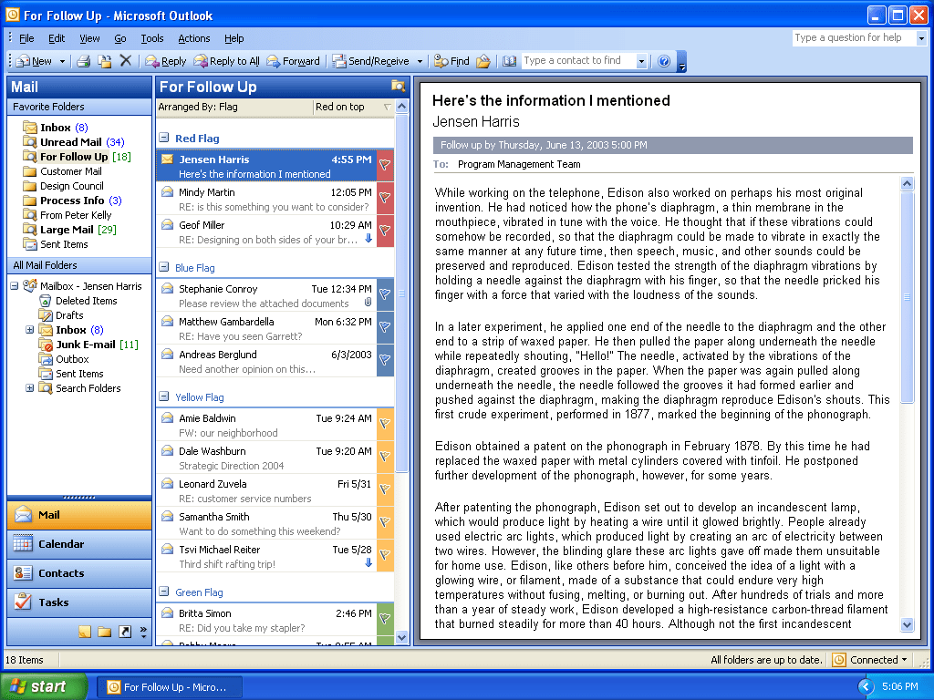
Search Folders were built out of a really simple but powerful idea: what if you could save a search and turn it into a virtual folder that you could use just like any other folder? It would update in real time, and you could read, flag, and respond to email in it just like any other “real” folder.
I imagined that you could do things like have a single folder that included all unread messages + things you had flagged for follow up. Or have a folder that included everything about your family, no matter what physical folder it was in.
This has now become a widely-copied feature, but at the time it was totally novel and we had to work through a lot of tricky interaction design challenges. For instance, if you are in an “Unread Email” folder and click the message to read it, it is no longer unread and should disappear from the folder. But that is confusing and leads to a chain reaction where messages seem to be auto-deleting themselves from the folder!

We knew that Search Folders would be a new concept for people and thus having concrete examples of the kinds of scenarios we imagined the feature being useful for would be key.
So, in addition to the more advanced ways of creating a Search Folder (such as defining the search terms yourself, or saving the results of a search as a folder), we created a simple dialog box containing a range of common scenarios. This turned out to be far and away the most popular way people made new Search Folders.

When we were studying how people use email, we discovered that there were broadly two main categories of users: filers and pilers.
Filers tend to move everything to a folder. They often have a well-defined and/or extensive folder system which might include nested folders. Most things filers read end up moved to a specific folder that makes it easy for them to know where to find related things again.
Pilers, on the other hand, just let most things pile up in the Inbox. They tend to use search as a primary way to find things, and often rely on categorization or tagging to mark special things to get back to them easily.
Quick Flags, which we introduced in Outlook, were designed to give these pilers an easy way to mark things for follow up without the overhead of needing to create a full-blown categorization system. There were only six colors you could use (by design) and marking a message gave you a simple way to see that it was special, wherever in Outlook it showed up.

Our Outlook reinvention wasn’t just limited to email, of course. The Navigation Pane on the left (called the “WunderBar” internally) took the email folder list and imagined “what could we do to make it contextually relevant?” As an example, when you are in the Calendar, the folder list is replaced by more useful widgets such as the date picker and a list of calendars you can view.
We also designed and built a side-by-side calendar view that made it easy to see multiple calendars at once with color-coding to help people track which calendar is which.
We also added a subtle “current time indicator” to the left side of the calendar list to make it easy to see “where in my schedule am I right now?”
More information
As the Outlook UI design happened at least a decade before it was commonplace to write more publicly about product design decisions, there’s not a lot written about it online.
One fun tidbit… a controversial keyboard shortcut truly loved by some and loathed by others, CTRL+ENTER to send an email message, is totally my fault. Here’s the story of how it came to be.
I also created the Outlook reminder sound which played 15 minutes before every meeting for more than a decade. Here’s the story of how it got created (and how my name mistakenly ended up in the sound file included in Outlook!)
And finally, here’s is a short blog post I wrote about the importance of labels in understanding user interfaces, using my experience designing Outlook as an example.