Surface: Designing a touch-first mobile UI from scratch
It was early 2009. The iPhone and its newly-launched App Store had opened people’s minds to the world of always connected, app-centered, touch-first devices.
Though Microsoft had made hardware for most of its history, it had never built a mass-market computer… and definitely not one that also doubled as a tablet.
I was given the job of leading the team that created the mobile user interface for the touch-first device that became known as Surface. This was before the iPad had been announced, and before it was known how users might interact with this new class of device. It was one of the biggest challenges of my career.
At the center of everything we did was our fanatical belief in making the interface “fast and fluid.” It needed to be responsive to touch, beautifully animated, and use natural gestures.
It was a time of infinite invention, and we shipped many ideas that years later ended up being integrated into iOS, iPadOS, and Android. Edge gestures, multitasking through “snapping”, a split touch keyboard, unified search, sharing, and settings APIs for apps to communicate between one another, multi-hand icon rearrange, and much more.
It was one of the most fun projects I’ve ever worked on, and it is gratifying to see so much of what we created still in the world today!
A closer look
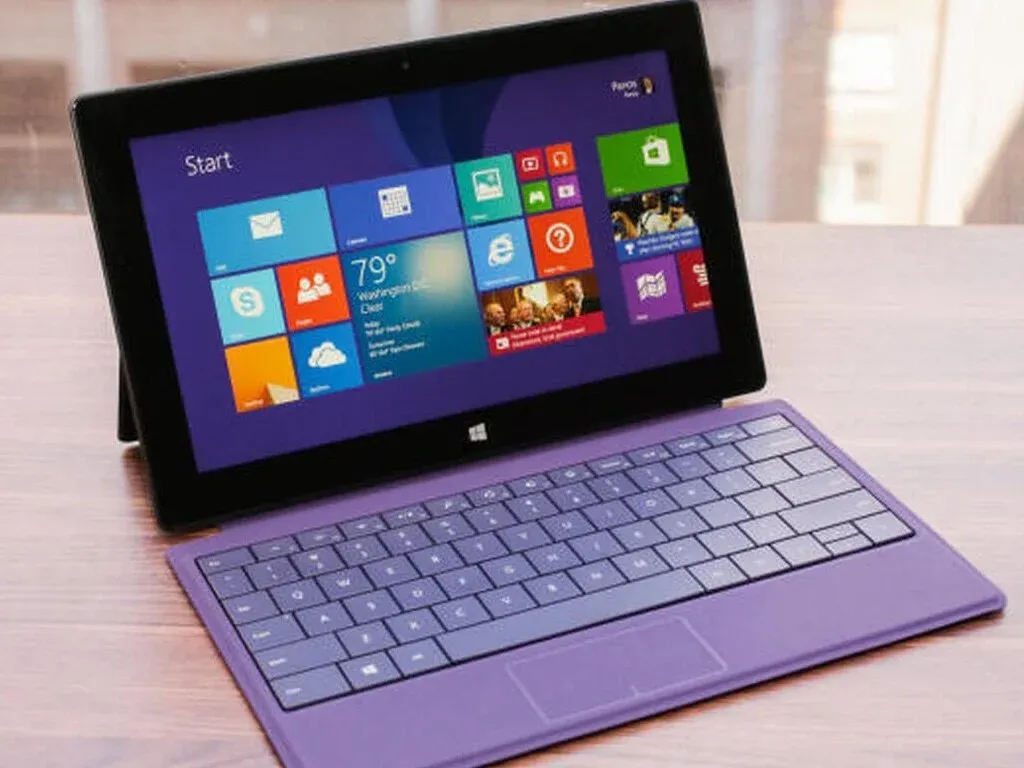
Surface is a line of two-in-one PCs created by Microsoft that can be used either as a laptop or as a tablet. The first two iterations, shipped in 2012, included the ARM-based Surface and an Intel-based Surface Pro.
We created a touch user interface from scratch for Surface, a three-year odyssey that required breakthroughs in interaction design, a new app development model, launching an app store from scratch, and working closely with the hardware team (in secret) to meld the experience of the software and hardware together.
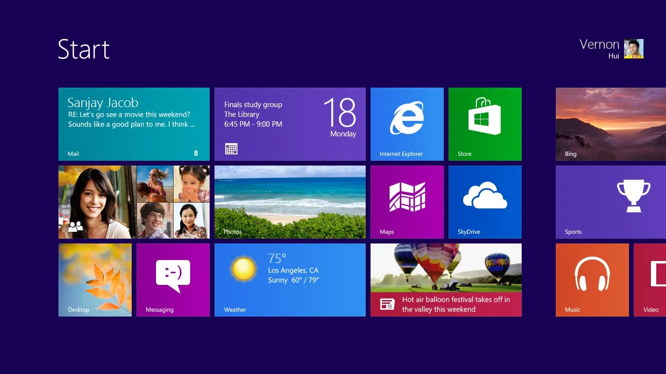
The Start screen was designed to be a more personal and differentiated alternative to the “endless grid of icons” seen on other mobile devices.
Tiles unified the predictability of icons with the power of widgets in a harmonized design language. Larger touch targets made them easy to press with a finger.
A key concept was that the tiles could be “live”—that is, they could show what was happening in the app without needing to launch it. A news app could show the most recent story, or the email app might show messages that recently came in.
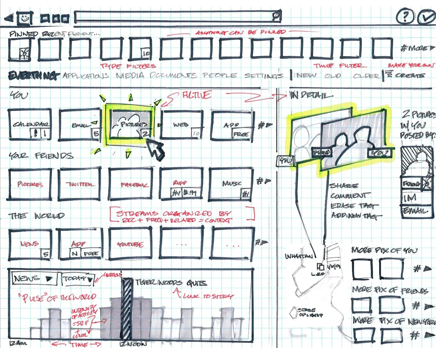
The team created thousands of sketches and designs that were considered, refined, critiqued, and ultimately shaped into the final set of designs.
My job was to coalesce all of these designs into a coherent experience that would not just power Surface, but also be shipped as a part of Windows for the vast ecosystem of hardware partners who also wanted to ship touch-capable PCs.
The visual design language of the apps was centered around the notion of “content before chrome.” Unnecessary commands and widgets were moved to the background to let photography and other content come to the foreground.
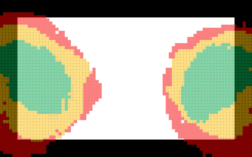
One of the ways we started to understand the ergonomics of holding a tablet (which were not well known in the time before the iPad) was by giving people special software that tested their grip and their reach on various size devices.
The “heat map” that was generated helped us understand what regions of the screen were easy and difficult to reach.
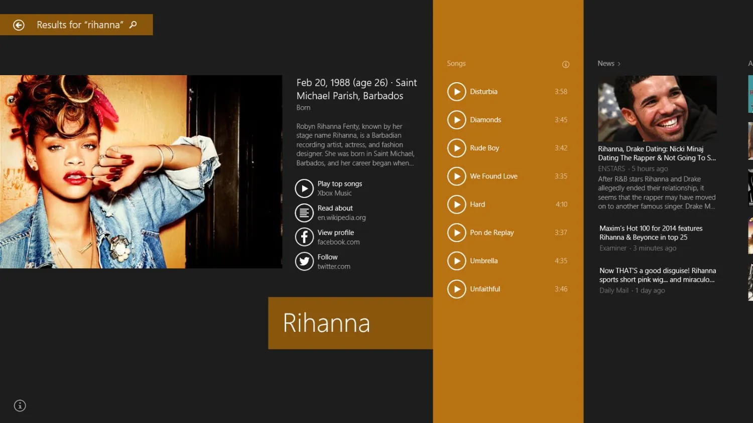
Important global functions like search, sharing, settings, and access to devices were designed to give the user instant access to them from any app with just a swipe from the edge of the screen.
A set of innovative developer APIs made it possible for any two apps to talk to one another in a generalized way. So, for instance, an up-and-coming photos app could share content to a yet-undiscovered social media app without either app knowing anything about the other one.
More information
While the iPad ultimately came to define the era of tablets, I am very proud of the work we did in this era. We invented so much that ultimately inspired and influenced the experience of using an iPad today.
If you are interested in going deeper into this work, here are a few videos you can watch:
8 traits of great Metro style apps: This was my keynote at //build, Microsoft global developer event. It was only moments after we first revealed to the world the existence of this new software experience, and I was the first person to get to give a full demo of it.
(We hadn’t yet told the world about the Surface hardware; that surprise was still a few months away.)
UX Week 2012 Keynote: At UX Week 2012, I gave a presentation that went into a lot of depth about how we designed this experience, showed some of the decisions and tradeoffs we made, and shared a lot of fun behind-the-scenes stories.