Redesigning Microsoft Office
In 2003, I was given the chance to lead the redesign of the most well-known suite of productivity software in the world: Microsoft Office.
Every day, over a billion people depended on apps like Word, Excel, PowerPoint, and Outlook, so it was a daunting task. This was the first redesign in the history of Office, and the work that we did ended up shaping the standard productivity experience for the next two decades.
My team started with first principles: How did we want it to feel to use Office? What problems and roadblocks were people having? What did the data tell us about where people were feeling blocked (itself a totally new way of thinking about user experience in the early 2000’s).
I codified this into a set of six simple UI principles that we used to help evaluate designs throughout the entire process. To make sure that the team internalized the principles, we used this document as the sample content for most of our internal Word designs:
In the end, in Office 2007 we shipped a set of UI innovations that not only transformed Microsoft’s software, but ended up widely copied through the industry: the Ribbon, Galleries, Live Preview, the Mini Toolbar, Contextual Tabs, Super Tooltips, and KeyTips are just some of the designs that live on in much of today’s software.
A closer look
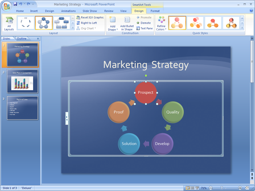
The Ribbon unified menus, toolbars, Task Panes, and all of the other many places commands lived through the products into one simple and extensible bar that was consistent across more than a dozen Microsoft Office apps.
Contextual Tabs allowed for context-specific tools to be woven into the interface when working with a specific object, like a picture, a chart, or a diagram. These additional tools are presented right inside the Ribbon, and disappear when they’re no longer relevant.
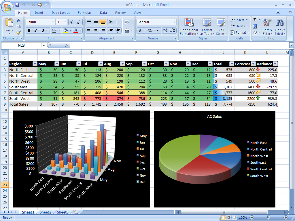
This new, more visual user interface even allowed us to make an app centered on numbers, like Excel, more visual and powerful, unlocking formatting and data visualization capabilities that had always been present but seldom used.
One of the things our telemetry data showed us was that 90% of users used less than 10% of all the features in our product. By making this existing functionality more visual and easier to understand, we hoped to enable more people to take advantage of the underlying power of the software.
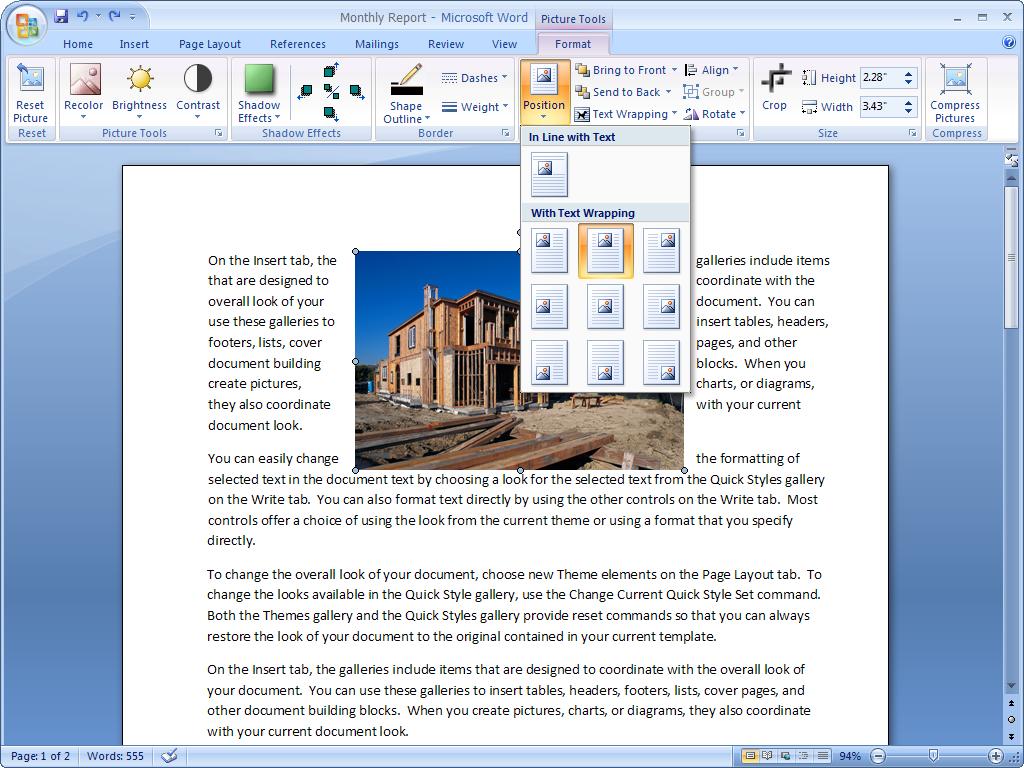
Galleries combined multiple commands into easy-to-understand visual dropdown menus that shows exactly what the end result was going to be.
We also invented Live Preview to enhance this experience: for the first time, just by hovering over an item in a dropdown menu, you could see what the result would be. We wanted to end the frequent cycle we observed of people applying formatting and then clicking Undo because they didn’t like the result.
The Mini Toolbar fades in above selected text to provide quick access to the most-used formatting commands in the product.
Taking advantage of Fitts’ Law, this small window required minimal mouse movement and thus can be accessed efficiently.
This design can be seen pretty widely in text editing experiences throughout most modern desktop productivity apps.
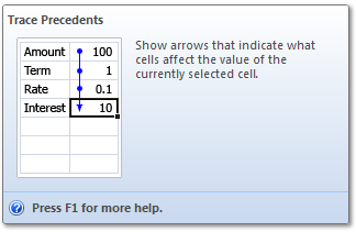
Super Tooltips, the predecessor of today’s omnipresent info cards in web and mobile apps, built on the tooltip concept by adding animations, detailed text, and interactivity to help users understand what a command was for and how to use it.
More information
I wrote a widely-read blog about the creation of the Office user experience. Although over the last 15 years some parts of it have eroded (I haven’t had access to update it for more than a decade), the basic writing is still there as an artifact of the work we did.
I’ve also given a number of talks and presentations about the work we did to reimagine Microsoft Office over the years. Here is a Harvard Business Review story and case study they wrote about the redesign which speaks to the challenges and risks we faced.


